Pages that get out of the way.
Nobody finishes a book and praises the typesetting. They just keep reading. That is the whole job — and it is the difference between a book that feels published and one that feels printed.
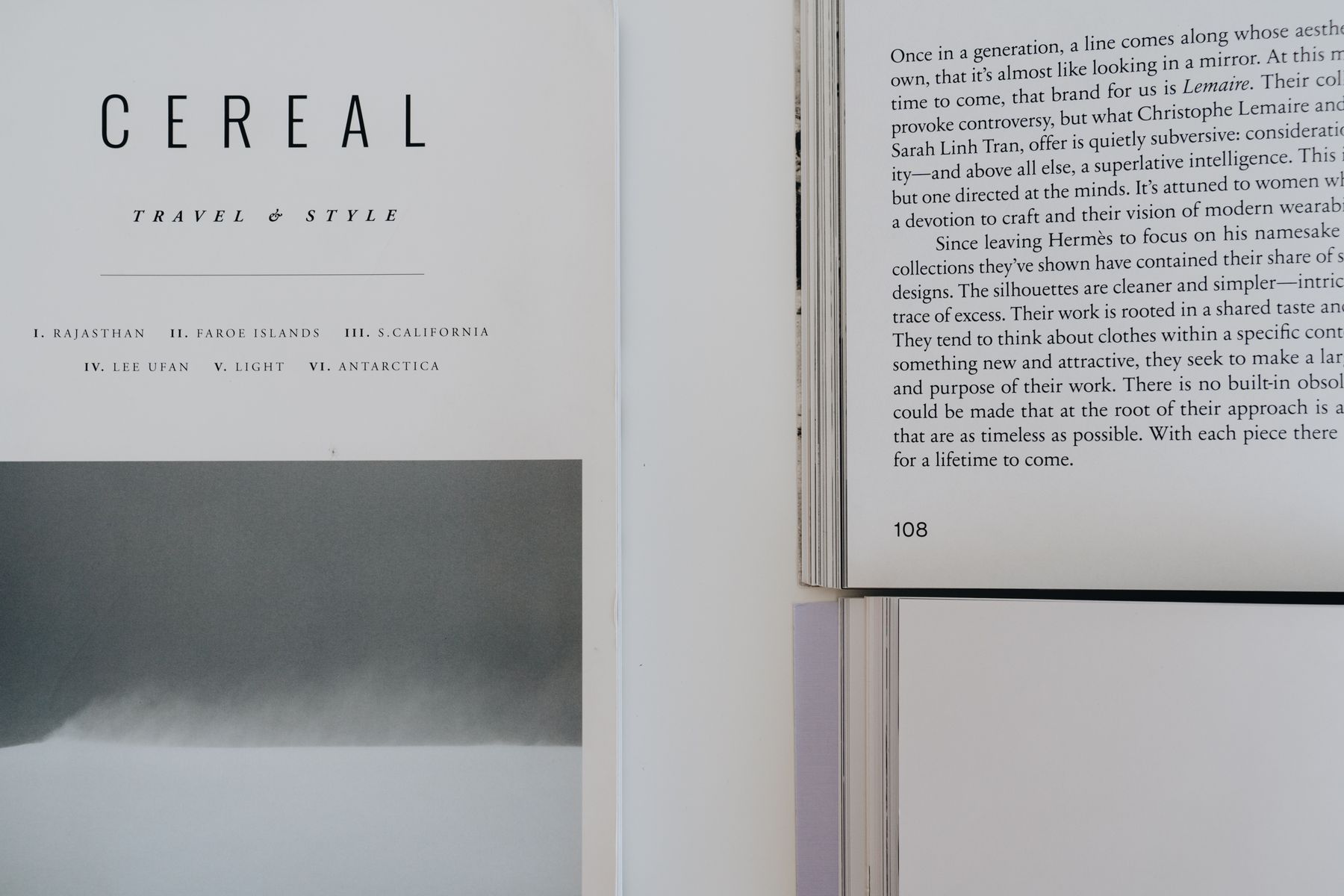
Readers notice bad typesetting. They never notice good typesetting.
A margin that is two millimetres too tight, a chapter opener that sits at a different height each time, a widow stranded at the top of a page — none of it is consciously registered. It just makes the book feel slightly wrong, and the reader puts it down a chapter earlier than they would have.
We set your book for the trim size you are actually printing, not a generic template stretched to fit. Every margin, chapter opening, running head and page number is a decision, and every one of them is made in service of somebody finishing your book.
What your Interior Design includes
Quoted as one piece of work. No page-count surcharges appearing halfway through, and revisions are part of the price.
The page itself
- Trim size and margin specification
- Type selection and sizing for readability
- Justification, hyphenation and spacing
- Widow and orphan control throughout
Structure
- Chapter openers set consistently
- Running heads and folios
- Part titles and section breaks
- Scene-break ornaments where they earn their place
Front and back matter
- Half title, title page and copyright page
- Dedication, epigraph and contents
- Acknowledgements and author bio
- Also-by pages and back-matter calls to action
Every interior design also includes a full marketing assessment — an honest read on where your book stands today.
Three interiors. Same manuscript, three different books.
Interior design is not one correct answer. A literary novel wants air and restraint; a commercial thriller wants pace and a strong chapter mark; a memoir wants warmth. Below is the same opening set three ways, so you can see what the choice actually costs and buys.
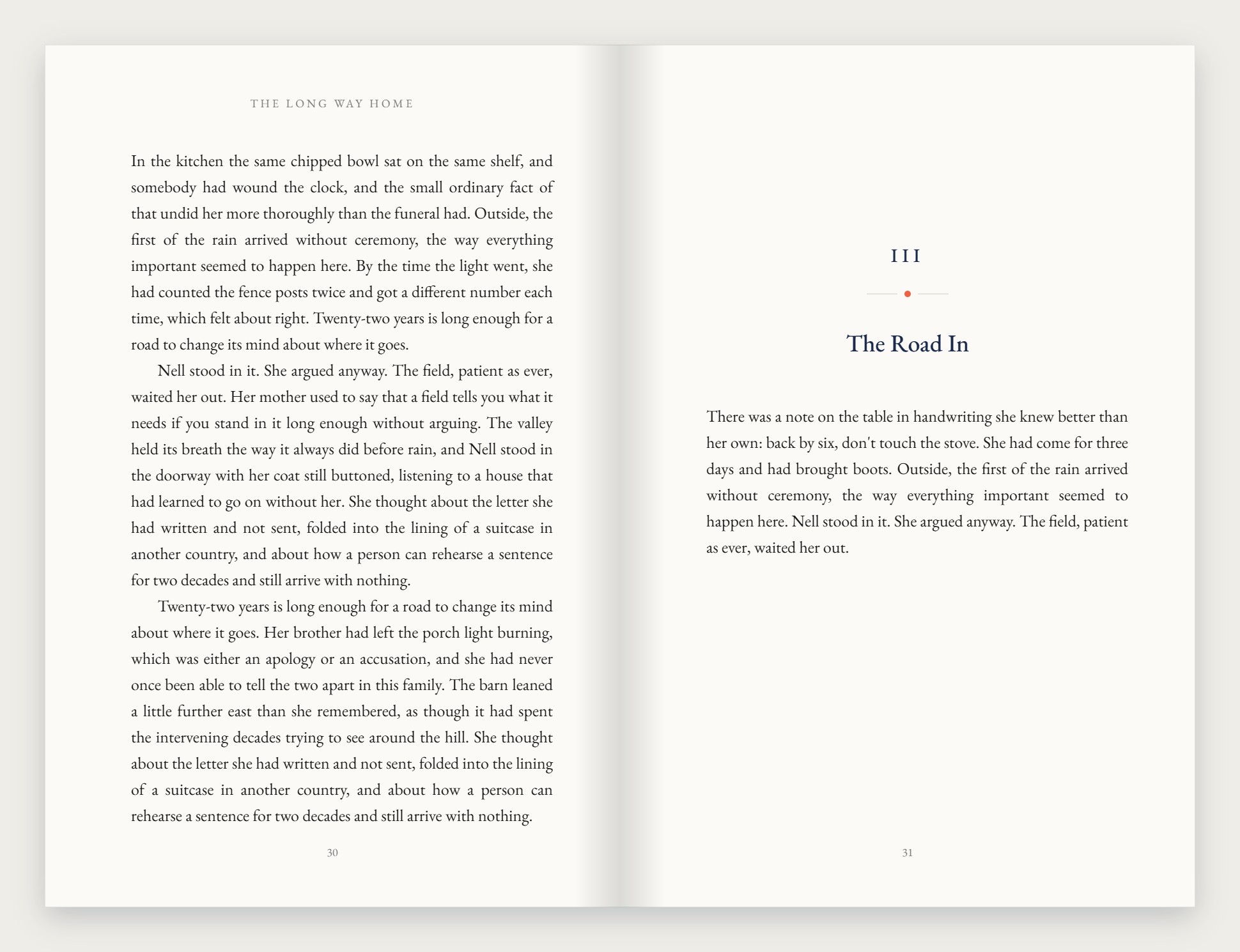
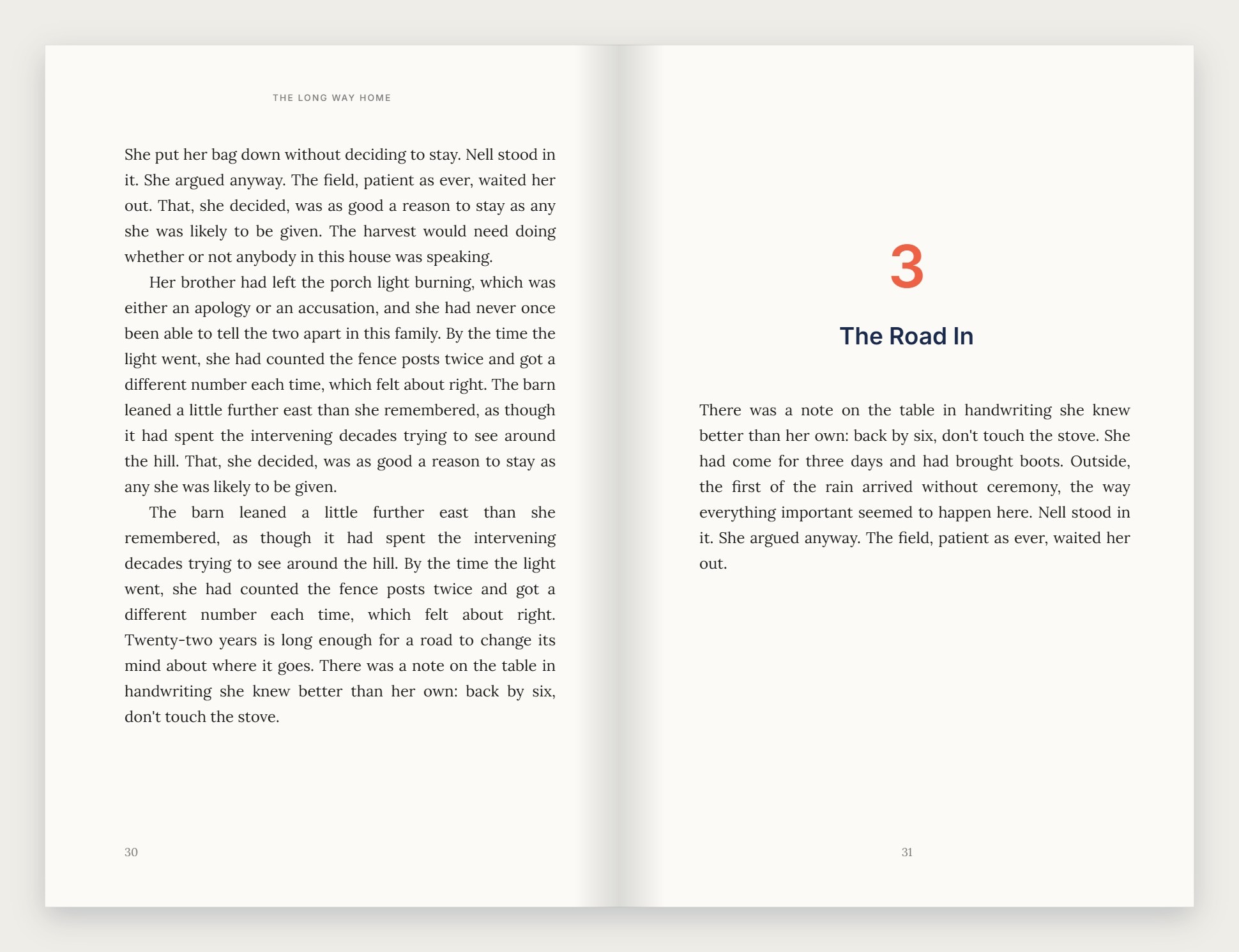
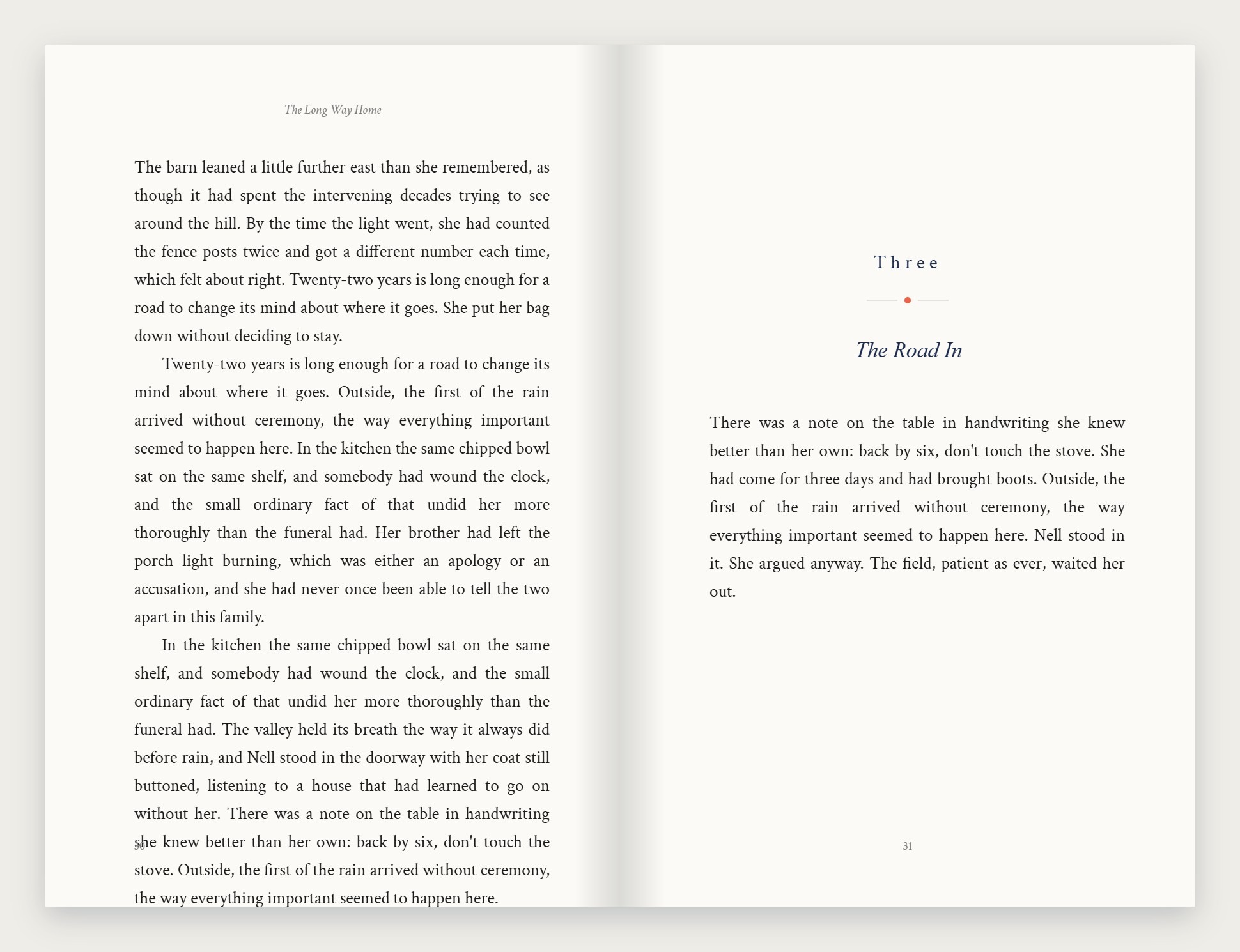
One book, half title to last page.
Every page in a book has a job, and most of them are pages nobody consciously notices. Here is a single title carried all the way through, so you can see exactly what you receive.
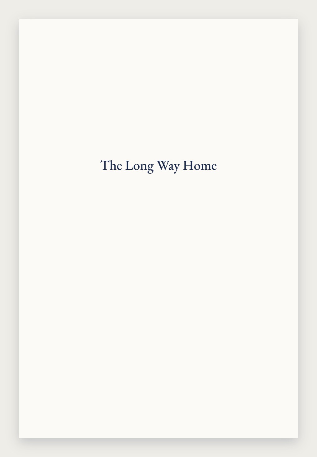
- Half title
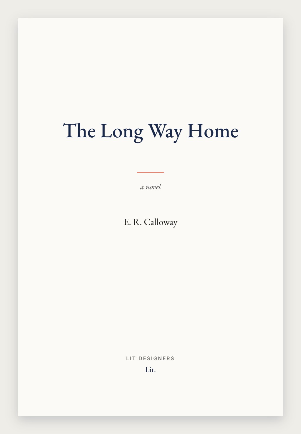
- Title page and imprint
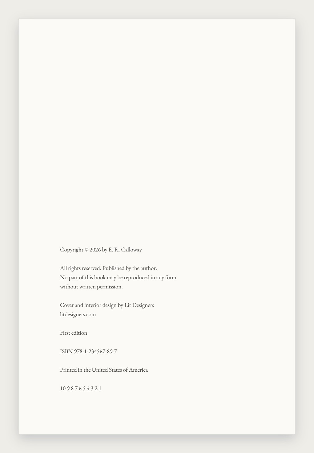
- Copyright and edition line
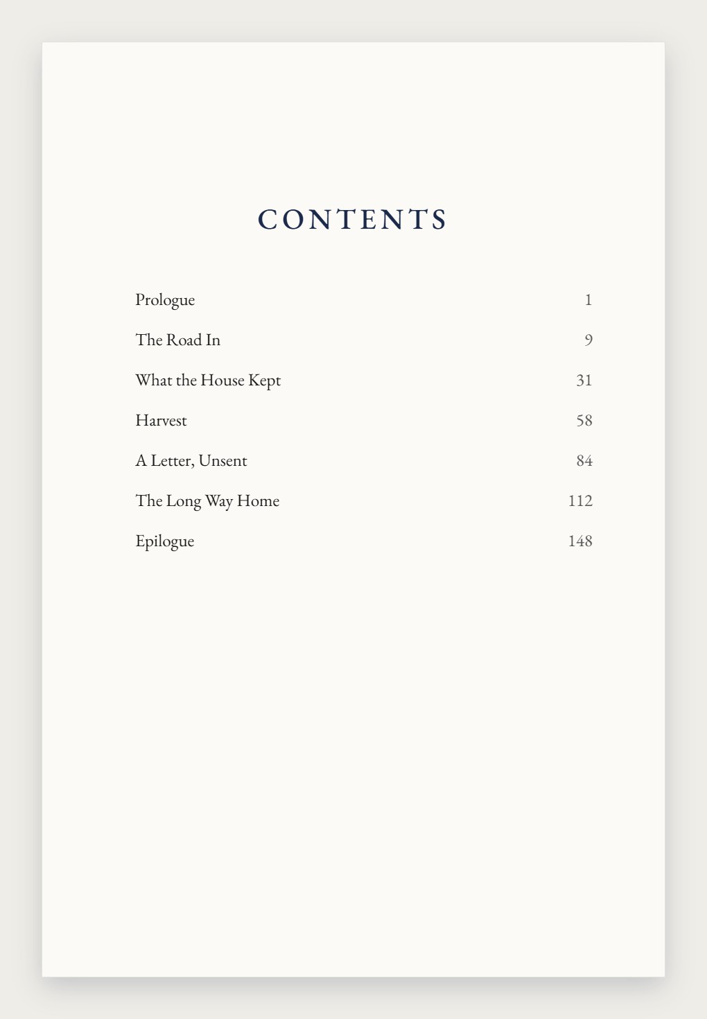
- Contents
- Chapter openings
- Running text, heads and folios
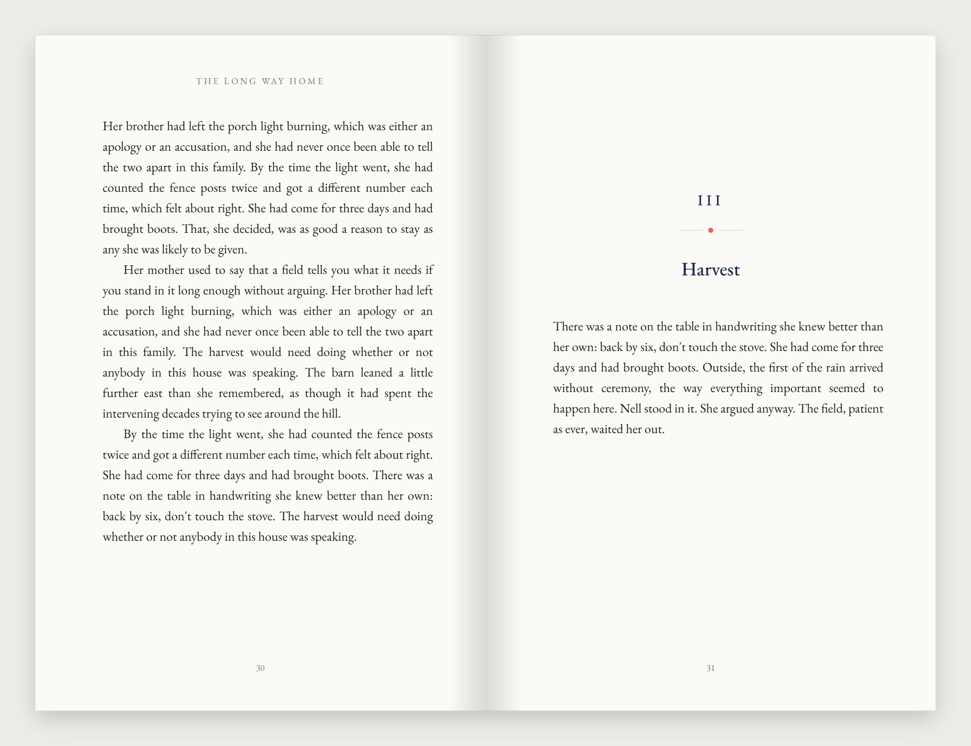
A chapter opening. Where the text starts on the page is a decision, and it is the same on every chapter in the book.
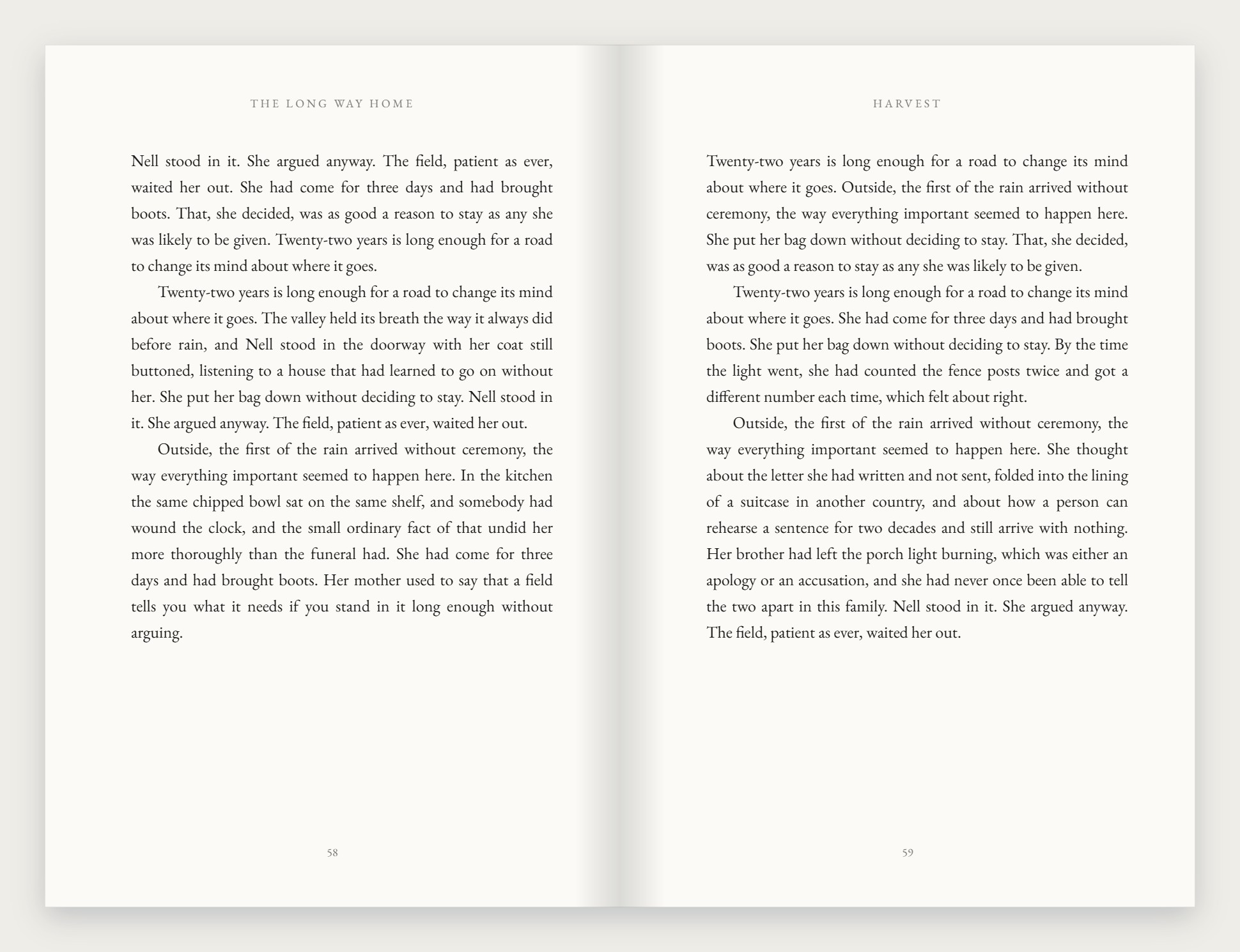
Running text. Heads, folios and margins holding steady for two hundred pages is the entire craft.
Included in the interior
- Image insertion. Photographs, maps and figures placed at the right size, captioned, and anchored to the passage that refers to them so they do not drift a page away in the final file.
- Footnotes and endnotes. Numbered correctly, kept on the page they belong to, and set in the same type family as the book so they read as part of it.
Available, quoted separately
- Indexing. A real subject index built from the finished pages, priced by page count once the interior is set.
- Chart and graphic production. Tables, diagrams and data graphics drawn from your figures to match the book’s typography, priced per figure.
Both are quoted and agreed before any work begins. Nothing appears on an invoice you have not already seen.
Print and ebook, built from one source.
A printed page is fixed. An ebook is not — it has to survive somebody reading it at double size on a phone on a bus. Producing the two separately is how they drift apart.
Same book, same typeface, same chapter, reflowing:
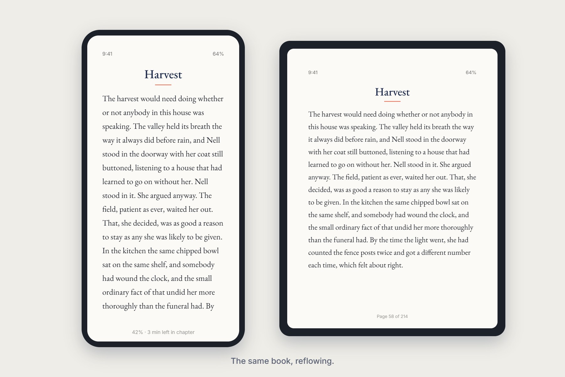
It stays your book
The typeface, the chapter marks and the hierarchy carry over. It does not become a generic document because somebody opened it on a tablet.
It actually works
Real reflowable EPUB with a working table of contents, tested at several type sizes. Not a printed page flattened into a picture.
It stays in step
Change a chapter title once and it changes in both. No drift between the paperback and the download.